
Mobile adaptation solution
background
Mobile devices have a series of adaptation problems caused by different brands, models, and different browsers used in different devices. In these devices, how to achieve the consistency of display effects and interaction is a headache.
develop
There are a variety of early adaptations.
Around Double Eleven in 2015, Alibaba's front-end team AmFe shared the mobile adaptation solution of flexible. In the next few years, flexible has become the mainstream mobile adaptation solution for use in major mobile applications.
With the development of technology, CSS3's viewport has received more and more device support. Gradually, viewport can be used directly as a mobile adapter solution, and began to enter the field of developers around 2017.
Later, AmFe announced that it was recommended to use the viewport solution instead of flexible, and the viewport solution gradually became the mainstream adaptation solution.
lib-flexible solution introduction
viewport
viewport is the browser window. In mobile devices, the viewport is too narrow. In order to better serve CSS, visual viewport and layout viewport are provided.
Physical pixels
Physical pixels, namely device pixels, are the tiniest physical components in display devices.
Device independent pixel (density-independent pixel)
Device-independent pixels are also called density-independent pixels, and can be considered as a point in a computer coordinate system. This point represents a virtual pixel that can be used by the program, and is then converted from the system to a physical pixel.
CSS pixels (CSS pixels)
The css pixel is an abstract unit, mainly used in the browser, to accurately measure the content on a web page.
Generally speaking, CSS pixels are called device-independent pixels, referred to as DIPs
Screen density
Screen density refers to the pixel density that exists on the surface of a device, which usually has how many pixels per inch it has to calculate (PPI)
Device pixel ratio
Abbreviated as DPR, defines the correspondence between physical pixels and device independent pixels
Device pixel ratio = physical pixels / device independent pixelsBrief description
flexible changes the value of the viewport in the <meta> tag according to the dpr value of the device:
<!-- dpr = 1-->
<meta name="viewport" content="initial-scale=scale,maximum-scale=scale,minimum-scale=scale,user-scalable=no" />
<!-- dpr = 2-->
<meta name="viewport" content="initial-scale=0.5,maximum-scale=0.5,minimum-scale=0.5,user-scalable=no" />
<!-- dpr = 3-->
<meta
  name="viewport"
  content="initial-scale=0.3333333333,maximum-scale=0.3333333333,minimum-scale=0.333333333,user-scalable=no"
/>
This allows the page to achieve the effect of scaling and realize the page adaptation function in disguise.
Main thoughts:
- Modify
viewportaccording to the value ofdprto implement 1px line - Modify the
font-sizeofhtmlaccording to the value ofdpr, so as to achieve equal-scale scaling using rem. - Use
hackto simulate the characteristics ofvwwithrem
use
px-to-viewport adaptation scheme
Flexiable is a vw feature that simulates vw through javascript. To this day, vw has been supported by many browsers. You can consider directly using vw units in our adaptation layout.
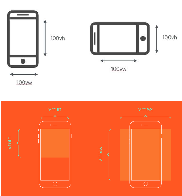
In css level3, four units related to viewport are defined, namely vw, vh, vmin, and vmax.
vw: viewport width abbreviation, 1vw is equal to1% ofwindow.innerWidth`vh: viewport height abbreviation, 1vh is equal to1%ofwindow.innerHeightvmin: The value of vmin is the smaller value in the current vw and vhvmax: The value of vmax is the larger value in the current vw and vh
In a 750px design draft, 100vw=750px, 1vw=7.5px, the px unit can be converted into vw units through the formula to achieve adaptation.
You can use postcss-px-to-viewport to help achieve automatic conversion
Scenarios that apply to vw adaptation pages
- Container adaptation
- Text adaptation
- Borders, rounded corners, shadows greater than 1px
- Inner margin and outer margin