
1px solution
In daily mobile front-end application development, a problem often encounters is that the rendering of 1px line under the mobile Retina screen does not meet expectations. The following are 1px solutions in several different scenarios.
Background and reasons
First of all, one concept that needs to be clear is that the pixels of CSS is not exactly equivalent to the pixels of the device. When we assume that the device's pixels width is the standard pixels width. These pixels determine the resolution of the device. By default, the user on the PC device does not perform a scaling operation (i.e. when zoom is 100%), the pixels of CSS overlaps with the pixels of the device. When the user performs a scaling operation, assuming that the user scales by 200%, then the 124px CSS pixels actually occupy 248 devices pixels.
But when we develop, the device's pixels are usually useless to us. The front-end only needs to pay attention to the CSS pixels. The browser will automatically handle whether the CSS pixels are stretched or contracted according to the user's scaling.
However, in mobile devices, due to the small width of the device, much less content can be displayed. The browser or zoom becomes smaller, causing the content to be unreadable, or you can browse undisplayed content by dragging. This has led to the CSS layout that was originally suitable for PC devices being placed on the mobile terminal and becoming very ugly.
To solve this problem, the usual practice of mobile device manufacturers is to make the viewport wider (the viewport here refers to the device's window, which determines the width performance of the HTML tag, and then affects other elements).
The viewport on the mobile terminal is divided into virtual viewport and layout viewport:
visual viewport: virtual viewportlayout viewport: Layout viewport
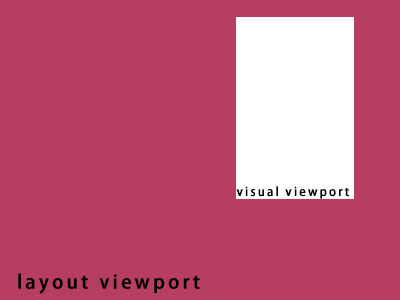
The concept of both, you can imagine that layout viewport is a picture of unchangeable size and angle, but it is blocked by a mask, and visual viewport is a window on a mask where we can observe this picture. We can observe part of the picture through this window. And you can drag or zoom this window to observe the complete content of the picture.
Here, visual viewport is equivalent to the screen of a mobile device. The user's zoom and drag operations are fed back to layout viewport, which is relatively dragged and scaled.
The CSS pixels we usually focus on are usually defined according to layout viewport, so it will be much wider than visual viewport. The width of the <html> element is inherited from the layout viewport. This ensures that your website's UI can perform consistently on mobile devices and desktop devices.
But how wide is the width of layout viewport, different devices and browsers, are different. For example, the iPhone's Safari uses 980px.
However, in mobile interaction, we do not expect the content of the website to be scaled, and users need to be scaled and dragged. So usually we will make a meta declaration in the head of the html file.
<meta name="viewport" content="width=device-width, initial-scale=1, user-scalable=no" />That is, the layout viewport is forced to be set to equal the device width, the scaling is set to 100%, and the user cannot perform the scaling operation. The benefit of this is that we can design the UI and interact in a desired way.
But before, we introduced that the pixels of CSS is not equivalent to the pixels of the device. Usually on mobile devices, we can view the ratio of CSS pixels of the current device and the device pixels through window.devicePixelRatio. If the value of window.devicePixelRatio is 2, it means that the width of 1 CSS pixels occupies 2 devices pixels, that is, the device pixels that actually occupies 2x2.
This is also the reason why the 1px line, rendering on mobile devices, looks thicker than the actual 1px.
If you know the background of the problem and the reason, you only need to make the performance of 1px' CSS pixels close to or fit the 1px device pixels, then you can solve this problem.
Solution
How to make the performance of 1px CSS pixels close to or fit 1px devices pixels. This problem requires specific scenario analysis.
border-width: 0.5px
One of the simplest and suitable solutions for various scenarios is to use the value of 0.5px instead of the value of 1px. But this solution has a compatibility issue, and modern browsers do not all support this value.
You can first check whether 0.5px is supported, and then add a class on the root element to use it.
if (window.devicePixelRatio && devicePixelRatio >= 2) {
  var testElem = document.createElement('div')
  testElem.style.border = '.5px solid transparent'
  document.body.appendChild(testElem)
  if (testElem.offsetHeight == 1) {
    document.querySelector('html').classList.add('hairlines')
  }
  document.body.removeChild(testElem)
}
div {
border: 1px solid #bbb;
}
.hairlines div {
border-width: 0.5px;
}The advantage of this solution is that it is simple and can adapt to all scenarios, but in terms of compatibility, iOS7 and previous versions, Android devices, etc. do not support 0.5px rendering.
Pseudo-class + transform scaling
This method is to use the pseudo-class of the element to render lines.
For example, use ::before or ::after to draw a line with the upper border
.hairlines {
  position: relative;
}
.hairlines::before {
  content: '';
  position: absolute;
  left: 0;
  top: 0;
  display: block;
  width: 100%;
  height: 1px;
  background-color: #000;
  transform: scaleY(0.5);
  transform-origin: 0 0;
}
For example, use ::before or ::after to draw a wireframe:
.hairlines {
  position: relative;
}
.hairlines::before {
  content: '';
  position: absolute;
  left: 0;
  top: 0;
  box-sizing: border-box;
  display: block;
  width: 200%;
  height: 200%;
  border: 1px solid #000;
  transform: scale(0.5);
  transform-origin: 0 0;
}
The benefits of this solution can also be adapted to most scenarios and support rounded corners. But the disadvantage is that since the element itself is set to the position and the pseudo-class is used, another interaction needs to use the occupied attribute, the problem needs to be handled accordingly.
border-image Picture
Use border-image-slice to offset border images.
The method of this solution, such as when processing lines in the x-axis direction, needs to prepare a 2px high picture. Depending on whether it is the upper border or the lower border, such as the upper border, the upper half of the picture is 1px first of the corresponding color, and the next half is transparent.
line.png 
div {
  border-top: 1px transparent;
  border-image: url(line.png) 2 0 0 0 repeat;
}
Similarly, dealing with borders in other directions is similar.
The disadvantage of this method is that if you change the color, or if there are lines of different colors, you need to prepare multiple pictures.
Priority is suitable for most scenarios, and no changes affecting the document flow are made to the element itself.
SVG
Since CSS also supports SVG as an image resource, and SVG is a vector image, it can obtain better fidelity than using images in jpg and png formats. It can meet the needs of different scenarios with CSS's background-image or border-image.
It is recommended that this solution be used with CSS pre-rendering, such as stylus/sass/less, or postcss related plug-in.
As in stylus:
// Draw a wireframe of an element
borderXY(color = #eee, radius = 8px) {
 $r = unit(radius/ 2, '');
 border-radius radius /*px*/
 background-image url(s("data:image/svg+xml;charset=utf-8,<svg xmlns='http://www.w3.org/2000/svg' width='100%' height='100%' viewBox='0 0 200% 200%' preserveAspectRatio='xMidYMid meet'><rect fill='rgba(0,0,0,0)' width='100%' height='100%' stroke-width='1' stroke='%s' rx='%s' ry='%s'///svg>", color, $r, $r))
 background-repeat no-repeat
 background-position 0 0
 background-size 100% 100%
}

// Draw an element's upper and lower borders
borderX(color = #eee) {
 border 0
 border-top: 1px solid color; /*no*/
 border-bottom: 1px solid color; /*no*/
 border-image: url(s("data:image/svg+xml;charset=utf-8,<svg xmlns='http://www.w3.org/2000/svg' height='200' width='100'><line x1='0' y1='25' x2='100' y2='25' stroke='%s' style='stroke-width:50'/><line x1='0' y1='75' x2='100' y2='75' style='stroke:transparent;stroke-width:50'/><line x1='0' y1='125' x2='100' y2='125' style='stroke:transparent;stroke-width:50'/><line x1='0' y1='175' x2='100' y2='175' stroke='%s' style='stroke-width:50'//></svg>", color, color)) 100 0 100 0 stretch;
}

// Draw an element's left and right borders
borderY(color = #eee) {
 border 0
 border-left: 1px solid color; /*no*/
 border-right: 1px solid color; /*no*/
 border-image: url(s("data:image/svg+xml;charset=utf-8,<svg xmlns='http://www.w3.org/2000/svg' height='100' width='200'><line x1='25' y1='0' x2='25' y2='100' stroke='%s' style='stroke-width:50'/><line x1='75' y1='0' x2='75' y2='100' style='stroke:transparent;stroke-width:50'/><line x1='125' y1='0' x2='125' y2='100' style='stroke:transparent;stroke-width:50'/><line x1='175' y1='0' x2='175' y2='100' stroke='%s' style='stroke-width:50'//></svg>", color, color)) 0 100 0 100 stretch;
}

// Draw the upper border of an element
borderTop(color = #eee) {
 border 0
 border-top: 1px solid color; /*no*/
 border-image: url(s("data:image/svg+xml;charset=utf-8,<svg xmlns='http://www.w3.org/2000/svg' height='100' width='100'><line x1='0' y1='25' x2='100' y2='25' stroke='%s' style='stroke-width:50'/><line x1='0' y1='75' x2='100' y2='75' style='stroke:transparent;stroke-width:50'//><line x1='0' y1='75' x2='100' y2='75' style='stroke:transparent;stroke-width:50'//><line x1='0' y1='75' x2='75' style='stroke:transparent;stroke-width:50'//></svg>", color)) 100 0 0 0 stretch;
}

// Draw the bottom border of an element
borderBottom(color = #eee) {
 border 0
 border-bottom: 1px solid color; /*no*/ // After setting border 0, if color is set to transparent, the border will become transparent
 border-image: url(s("data:image/svg+xml;charset=utf-8,<svg xmlns='http://www.w3.org/2000/svg' height='100' width='100'><line x1='0' y1='25' x2='100' y2='25' style='stroke:transparent;stroke-width:50'/><line x1='0' y1='75' x2='100' y2='75' stroke='%s' style='stroke-width:50'/></svg>", color)) 0 0 100 0 stretch;
}

// Draw the left border of an element
borderLeft(color = #eee) {
 border 0
 border-left: 1px solid color; /*no*/
 border-image: url(s("data:image/svg+xml;charset=utf-8,<svg xmlns='http://www.w3.org/2000/svg' height='100' width='100'><line x1='25' y1='0' x2='25' y2='100' stroke='%s' style='stroke-width:50'/><line x1='75' y1='0' x2='75' y2='100' style='stroke:transparent;stroke-width:50'/></svg>", color)) 0 0 0 100 stretch;
}
// Draw the right border of an element
borderRight(color = #eee) {
 border 0
 border-right: 1px solid color; /*no*/
 border-image: url(s("data:image/svg+xml;charset=utf-8,<svg xmlns='http://www.w3.org/2000/svg' height='100' width='100'><line x1='25' y1='0' x2='25' y2='100' style='stroke:transparent;stroke-width:50'/><line x1='75' y1='0' x2='75' y2='100' stroke='%s' style='stroke-width:50'/></svg>", color)) 0 100 0 0 stretch;
}

div {
 borderXY()
}
```

If you are using `postcss`, you can use the installation plugin [postcss-write-svg](https://github.com/csstools/postcss-write-svg) to use it in conjunction with

```css
@svg square {
 @rect {
 fill: var(--color, black);
 width: var(--size);
 height: var(--size);
 }
}

.example {
 background: svg(square param(--color green) param(--size 100%)) center / cover;
}
```

The advantage of using SVG is that it supports adjusting the color of the line and setting rounded corners. You can choose `background-image` or `border-image` to satisfy most scenarios according to the scene.

### background-image + jpg/png Picture

This method is to use a background image of multiple times the element to render the line.

This practice is generally not recommended.

### Background gradient

This solution is not recommended

### box-shadow

This solution is not recommended